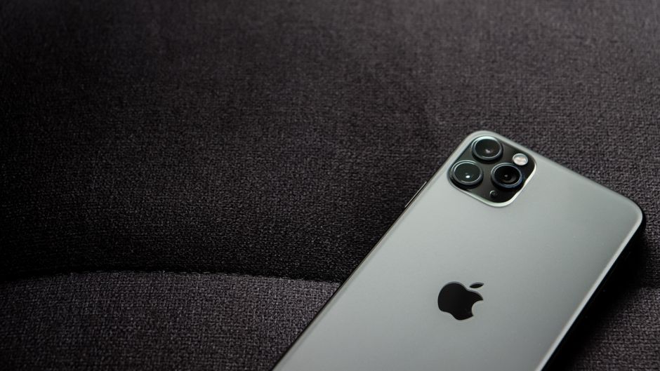
Is Google trying to tell us something, or just showing us how little it cares about basic user experience? This question hangs heavy over the Pixel 11 Pro’s much-touted HiLight feature, a shiny new trinket that arrives dead on arrival.
According to The Verge, the new HiLight notification LED on the Pixel 11 Pro is “nearly useless” right out of the box. Its incredibly limited functionality allows it to glow for only two specific scenarios. These include when the phone is face down and actively interacting with Google’s AI assistant, Gemini, or when a call comes in from a pre-selected favorite contact.
What’s the Deal with This Feature?
Remember when notification LEDs were a staple? They were simple, elegant solutions to a universal problem: how do I know if I have an important message without constantly checking my phone? BlackBerry had them, early Android phones thrived on them, and users customized them with vibrant colors for different apps. They provided at-a-glance information, saving battery and user mental load. Google, however, seems to have forgotten this fundamental principle of user-centric design with the Pixel 11 Pro.
The decision to cripple the HiLight feature in its native state isn’t just an oversight; it feels like an active choice. It’s a choice that prioritizes Google’s specific AI integrations over the practical needs of its users. Why introduce a hardware notification light if you’re going to shackle it to such narrow, almost performative, functions? This move hints at a deeper philosophical divide within tech giants. Are they building tools for us, or merely showcases for their latest pet projects?
The Pixel 11 Pro is supposed to be a flagship, a pinnacle of Android innovation. Yet, it delivers a feature that requires a third-party app to unlock its most obvious utility. This isn’t innovation; it’s an admission of failure. It forces users into an unnecessary workaround, adding another layer of complexity to something that should be intuitive. The very idea of a “Pro” device shipping with such a glaring functional limitation is baffling.
This isn’t just about a blinking light; it’s about control. Google wants to dictate *how* you receive notifications, pushing you towards specific interactions. They want you face-down, engaging with Gemini, or only responding to their definition of a “favorite” contact. It’s an ecosystem play, pure and simple, but one that actively diminishes the user experience for the sake of internal strategic alignment. The fact that a developer had to step in highlights Google’s tunnel vision.
The True Cost of ‘Smart’ Features
The mainstream narrative often celebrates “smart” features, but this HiLight debacle exposes their hidden cost: the erosion of basic, reliable functionality. Google is so focused on pushing Gemini and its AI ecosystem that it overlooks what users actually value in a notification system. They’ve swapped utility for a very narrow, Google-controlled interpretation of “smart.” This prioritization of proprietary AI integration over fundamental user customization is a dangerous trend.
What does it say about the state of smartphone innovation when a major company introduces a hardware feature only for it to be rendered useful by an external application? It suggests a profound disconnect between designers and actual users. Google seems to be living in a bubble, assuming that its internal priorities align with what people want from their devices. They’re building for their roadmap, not for the real world.
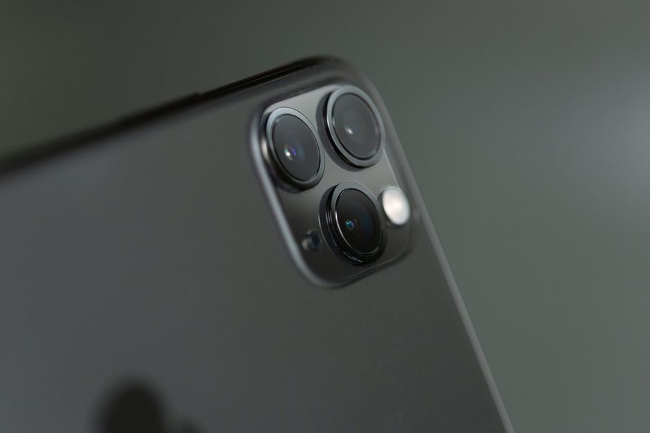
The reliance on third-party developers to “fix” Google’s own hardware is a pattern that should concern us all. It implies that the core product isn’t complete, isn’t fully thought out. While the developer community often fills critical gaps, it shouldn’t be responsible for activating basic functionality that should exist from day one. This makes the user experience fragmented and inconsistent.
On the other hand, some might argue that Google’s approach encourages developers and fosters a vibrant app ecosystem. That’s a generous interpretation. More likely, it’s an admission that Google either didn’t have the resources, the foresight, or simply didn’t care enough to implement comprehensive control for the HiLight feature themselves. They offloaded the work, and the user pays the price in complexity and convenience.
This whole situation underscores a frustrating truth: sometimes, the “smartest” features are the ones that just *work*, simply and reliably, without needing an advanced degree in Google’s product strategy. The Pixel 11 Pro’s HiLight is a glaring example of how overthinking and over-engineering can lead to under-delivering. It’s a reminder that true innovation lies in solving problems elegantly, not in creating new ones for users to navigate.
So, where does this leave us? With a powerful device that’s needlessly handicapped, and a testament to the enduring power of independent developers. Google needs to remember that functionality isn’t always about what’s new and flashy, but what’s useful and intuitive. Otherwise, their “innovations” will continue to feel more like chores than conveniences.
Source: The Verge